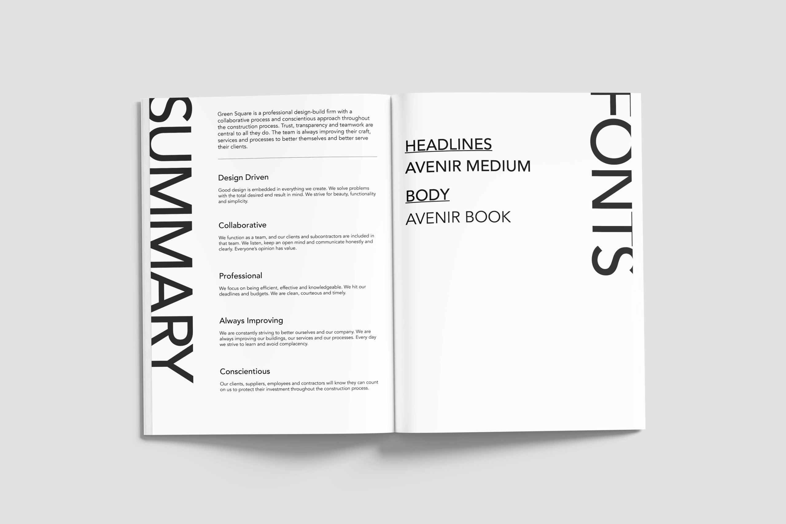
We chose fonts that carried both elegance and approachability. Avenir Medium for headlines. Avenir Book for body text. The color palette balanced grounded tones and bright accents, all carefully translated for both digital and print use and chosen to reflect Green Square’s aesthetic while remaining practical across mediums.
But a brand is more than fonts and colors. The most meaningful work came in articulating values. Green Square’s commitments to collaboration, professionalism, improvement, and care needed to be more than just internal beliefs. They needed to be written down, shared, and practiced. Together, we crafted a clear summary of what makes the firm distinct. Not as a mission statement. As a compass.